
Color: A New View

 My second year of school at Studio Incamminati has been filled with so many new changes and delightful experiences including color!
I felt as if last year, which was my first, was an endurance test where I was challenged at every turn to create charcoal drawings as realistically as possible using the least amount of information and only straight lines. This practice is still a requirement of course, but as a second year student, I am thrilled to be using two new media that bring so much joy to my daily living here: graphite and brilliantly colorful oil paint.
Graphite is my ‘go to’ medium that I have used since I was a little girl. Ages and ages ago, I would draw and even copy illustrations from magazines on sketch paper. As an adult, I continued to sketch in the margins of note pads I used during day job meetings.
Now, as an aspiring figure painter, I am learning to hone my skills to paint and draw the beautiful, ever-challenging and amazing human figure. At this stage in my learning, I find that I still struggle with proportion and accuracy. But each day, I address this challenge with short 5-minute poses where we use simple line drawings to capture the essential gesture of the pose. Then we progress to longer poses and are training our eyes with imaginary plumb lines, horizontal references and careful coaching from teachers.
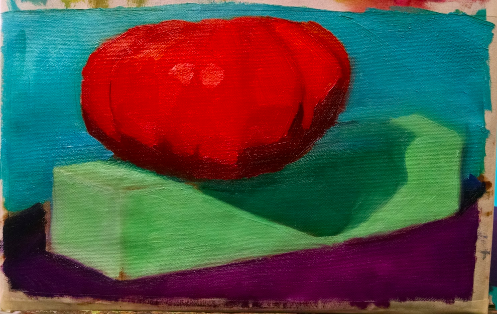
In addition to graphite drawings, we’ve now brightened up our weeks with still life color studies. The challenge with these studies is to learn how to show the impact of light on color. Sounds easy – eh? The color study of the bright orange pumpkin above is number 49 or 50 – ish and I am only just, barely starting to see how to use the 20+ brilliant colors of the Studio Incamminati palette and show the impact of light.
Ultimately, I’ll be working on combining these skills of gesture, accuracy, and proportion with showing the way light falls on color to represent both still life objects and the human figure. Stay tuned and join me as I share the ups and downs of this incredible experience of learning to see and use color.
8 Comments
beth clary
October 15, 2015Juile! Fabulous colors! I especially love that aubergine under the pumpkin. Reading an interesting book right now called The Art Forger and a lot of it is talking about how to recreate a known painting and trick authenticators into believing its THE one. The discussion of color and ways to modify colors makes me think of you and how to develop one’s personal pallette. These are things I’ve never thought about. So I would love frequent posts on the evolution of your thinking about color. To have an example of your work adds to the understanding. VERY excited for you!
Julie Holmes
October 15, 2015Hi Beth,
Yay! Glad you enjoyed reading about the colors and palette I’m using here at school. The ‘lineage’ for the approach (including the gazillions of color studies) is Henry Hensche who was one of Nelson Shanks’ mentors. Hensche had a school on the Cape (Cod) from the late 1930’s till mid-1990s. We’re studying and reading about his approach and doing as many color studies as possible to help us learn to see and communicate the impact of light on color.
It is an engaging and challenging process to consider more than just the local color of an item (such as the ‘orange’ color of the pumpkin). Rather, we are learning to look at the color (it’s value, temperature and saturation) and compare it to surrounding colors.
This process is experiential meaning that one learns best by doing.
Thanks again for reading (and commenting) and I’ll be updating more about this and the challenges of drawing and painting the figure again soon.
Ruth Whitney
October 15, 2015Hey Julie,
Color! Vibrant colors must really change how you try to communicate what you see – especially after a year drawing with blacks, whites and greys. It must feel like the sun came out after a week of gloomy rain.
The contrast of the pumpkin against the blue background grabbed my attention. I wish I had better names for colors like Beth saying she loved the aubergine. Can’t wait to see more.
Ruth
Julie Holmes
October 16, 2015Hi Ruth,
Yes – you are so right about these colors feeling as if I’ve come out of a long stint (a year!!) of gloomy rain. So true!
I loved the complimentary colors of blue and orange, too. Although I can’t take credit for the setting up. My fabulous teachers, Natalie Italiano, and Katya Held, do that for now.
I hope to share more updates on life here soon and hope it’s a good distraction for you from ‘renovation’ central.
😉
James Courtenay James
October 16, 2015Great to see all that hard work paying off! And what a place to learn about color.
Julie Holmes
October 16, 2015Hey there JCJ!
You are so right about this place being a fabulous place to learn color!
Hoping all is well with you and your colorful paintings in TN. David says to say ‘hello!’ tooo.
Milissa
October 16, 2015Cool gig girlie!! Very interesting to be sure. Seems analytical which requires a brain to use math in a different sort of way (it’s all math. Even art 🙂 ) Love the posting. Hopefully we will cross paths soon!! 😘
Julie Holmes
October 16, 2015Hey MM,
Great to hear from you and, yes, I have been surprised how much analytical and mathematical work there is to do in this place!
But it’s helping me to create (ultimately I hope) the concepts and ideas I have in my head so why not – right?
Would love to see you and Kenny next time you’re in NC or PA!