
Be Prepared

What is it about painting that requires the saying “Be Prepared?” AH! So many reasons, gentle reader! But first, here’s a link to a description of this post and blog for any newcomers here (welcome). Shall we cover this week’s topic, then?
The Perks of being prepared
If you like me are aware of your skills and being prepared needs…well…some preparation, then read on. As a young person, I confess I had my head in the clouds. Hence, I was not prepared or punctual. My loving parents had the ultimate conflicting message too: one parent was punctual while the other was not.
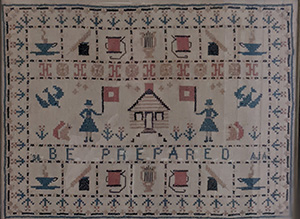
In fact, as older siblings paired up and moved out, there became a family mantra and it was called “Dyer Time.” Read: always late. So, I find it wonderfully ironic that my dearly departed mama cross stitched this sweet message, “Be Prepared.” Here it is up close. She was always late.
Change is Imminent
One of the great things about moving away from punctual dad and late mom has been the people I have met. So many of the people I have met offer skill sets and habits worth noting, if not emulating. Take Karen Kelly Bacot, for instance. I met her when I was 22 years old, newly relocated to Charlotte, NC, from Boston. She hailed from Alabama. Even though one of her sisters warned her I was from “up north” she, being the open-minded and perpetually optimistic person that she is, decided to move into the house I was sharing with a bunch of other people.
Not only was Karen prepared for anything and everything she did at work, she was punctual and a whole lot of fun too. Hmmmm…note to self. We got along so well that we decided to rent a place together a year or so later. I was doing a corporate sales gig that required 3 or 4 nights on the road. Karen had decided to leave the corporate world and open her own graphic design practice. She flourished!
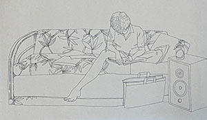
When she wasn’t designing, she was drawing. Here’s a drawing she did of me. I love this drawing for so many reasons. First, it shows a new me preparing for a meeting. Second, it’s show Karen’s fabulous drawing chops.
Fast Forward
Fast forward to this past weekend. What am I doing? Preparing of course. For what you might ask? I was preparing for my first “Instagram Live” talk about my artwork on display at Stokes County Arts Council. Preparing was fun because I could put Instagram Live in “practice” mode and talk, adjust lighting, rewrite what I wanted to say, etc, etc, etc.
What in the world does this have to do with Karen Kelly Bacot you might ask? As I’m chatting away in practice Instagram Live, I see a video call coming through from none other than Karen Kelly Bacot. Of course, I pressed answer. And, guess what? It was a pocket dial. But, it was so exciting because I got to chat (and see!) with Karen and her daughter, Kelly, who was getting ready for her wedding day. How sweet is that?
Just think, if I hadn’t been practicing, I wouldn’t have had this short, sweet encounter with a dear old friend! Another reason and reinforcement to be prepared.
Be Prepared to Paint
But wait, this is a blog about painting, so let’s be sure to cover some good painting info, too. Now that I have set up the show at Stokes County Arts Council (woot!), I am back in the studioooo. Well, first I cleaned said studio like crazy but I digress.
My latest form of preparation is studying some new colors I have never used before. This may seem impossible. After all, I studied at the color center of the universe: Studio Incaminnati. But, it’s true, there are so many oil paints that I have never used. So I will share first how I discovered these paints and then how I am studying these new colors.
The Beauty of Other Painters
Lately, I have been enthralled with several other painters. You may recall that earlier this year, I studied with Adriano Farinella. Ooh la la his cloud paintings are amazing and his feedback and instruction were, too. He and another artist friend introduced me to Claudia Rilling’s work. Oh my goodness I love her painterly work. And, I have also been enthralled with MA-based artist, Donald Jurney. Oooh la la! His imaginary landscapes and interiors are amazing. And, since I am taking time to study landscape painting, I am enjoying Deborah Paris‘ work, too.
Each of these artists share materials and paints they use through websites and workshop offerings. So, I recently treated myself to the following colors: Gamblin Chromatic Black, Gamblin Hansa Yellow, Gamblin Napthol Red, Rembrandt Permanent Madder Brown, Rembrandt King’s Blue, Gamblin Transparent Earth Yellow.
In addition, I have a (huge) fear of using a palette knife. So I decided to create an exercise that requires gentle introduction of that tool with these new paints.
Hello New Paints
My first step is to mix each of these colors with white. In each case, I tried to lighten the color so that the fifth mix is still showing some of the original color. OK, here’s a photo of my first attempt at mixing these new colors with white and a palette knife. I had a funky piece of canvas paper so these mixes are a bit wonky. And, at the last minute, I got curious about how Chromatic Black (lower left) compares to Ivory Black (lower left but to the right of Chromatic Black).
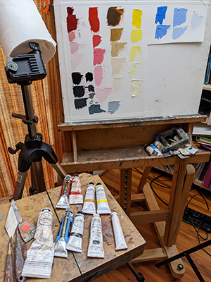
The Brown Madder is the top left color. Napthol red is next to it. Then the Transparent Earth Yellow followed by the Hansa Yellow. The King’s Blue is in the top right corner.
What Surprised Me
Color is relative. Meaning? Meaning lots of color’s impact is relative to it’s surroundings. But even knowing that, here’s what surprised me. I am really surprised with the rich pink color that is Brown Madder with white added. If Napthol Red was at party, it would be loud and friendly. Why do I say that? The red is ever present even after I added quite a bit of white. In other words, I am impressed with Napthol Red’s staying power (chroma) even after I added a good amount of white.
Transparent Earth Yellow is the introvert in the crowd. I want to get to know it more. And, my mind is wondering if I can use another color in it’s place? Such as? I’m not sure. It’s value straight out of the tube is so dark. Nice! But once I added white to it, it looked as if I could use a different variation of an earthy yellow and get the same result. Bottom line: more study and comparison required.
That Hansa Yellow is a new and intriguing color too. And, I say that as someone who is not a huge fan of yellow. I want to compare it to Naples Yellow, Winsor Yellow, Lemon Yellow, Raw Sienna, Yellow Ochre. You know just hide in the studio for a month and do more palette knife mixing white studies. But I betcha I will get too antsy to do this. We’ll see.
And, sorry, my initial reaction to King’s Blue – meh! It looks cooler than Cerulean Blue but just not that appealing to me. Who knows! I may use it in some super speedy color sketches from imagination and fall in love with it. But I kinda doubt it.
What About Chromatic Black
Even though this post is about being prepared, I am not prepared to make a decision about Chromatic Black for so many reasons. Such as? Well, first of all, in art school, we never used black paint out of the tube, ever.
We had to mix, you guessed it, a chromatic black. Sometimes I would use Alizarin Crimson or Quinacradone Magenta and Phtalo Green (er guess what the ingredients are on the tube of Chromatic Black). It’s a warmer black than Ivory Black, at least at first blush. So, I have more paint mixing to do here. Don’t you agree?
Good News
The good news is that I wielded a palette knife. It’s so weird. Even though I am a left-handed painter, I felt more comfortable holding the palette knife in my right hand. Yes, I even felt more comfortable mixing the paint with the palette knife in my right hand. Who knows maybe I will use the paint brush in my left hand and the palette knife in right at the same time? Oh good grief no!!! I still have a long way to go learning how to move and control the paint with the palette knife. So stay tuned.
What’s Next
There’s so much more that’s next. In fact, I would be remiss if I did not mention the opening for my and Ellen Gamble‘s show at Stokes County Arts Council on Friday, May 27 from 5:30 to 7:00 pm. Here’s the visual version. See you there?

But there are paintings to do too. Yes? I hope to venture on some new ideas and color sketches. And like any good idea, each needs time to percolate and grow here in the studio.
What About You
How about you gentle reader? What have you realized you need to do to be prepared? I bet you have some ideas and thoughts on this that might be really helpful. So please do share in the comments below and thank you for reading here today!
3 Comments
Beth Dyer Clary
May 19, 2022Lot here, Julie! Fascinating how colors did and did not change with the mixing. That surprises me and I have to believe there’s some magic in the explanation for that.
Just now told Bill how I thought he should be prepared for a business call. I who am no business person but who stole from my sister (you!) to express to him the value of writing things out, practicing the conversation and “being prepared!”
Always good to be prepared; ask a Scout!
Julie Holmes
May 25, 2022Ha Beth! That’s pretty amazing that your Bill needs phone prep tips…really? Can’t believe that! But hope Peg’s “be prepared” mantra helped.
I love mixing up different colors to see how they behave. It’s interesting to see how much staying power each has. In other words, which colors seem to hold their chroma, even when I add more and more white. So it’s not so much that the color itself changes. It’s more about whether the color is visible the more white I add. In this particular experiment, the napthol red definitely wins the staying power (chroma) prize.
Thanks so much for reading this week’s long post and commenting too! xoxoxo
Julie Dyer Holmes, Fine Artist Musings on Painting and the Palette Knife - Julie Dyer Holmes, Fine Artist
May 25, 2022[…] as I mentioned last week, a palette knife feels more comfortable in my right hand even though I’m a lefty. But, I […]