
Homage to Cezanne

In 2014, there was a show of Cezanne’s work at the Barnes museum in Philadelphia. So, is that why I decided to name this week’s painting “Homage to Cezanne?” Actually, no. The reason I set this still life up is that I have learned a bit more about Cezanne, his influence and art in an online class I have been taking. I wanted to think about his apple paintings while I painted my own.
Favorite Things
But first, I am excited to share this week’s “Favorite Things” painting. You may recall that in early 2020, I promised to share a painting, or perhaps a drawing, every week.
Now, let’s talk about Cezanne. I confess that I have not been a huge fan. Nor were there any fans, that I knew of, when I was at art school in Philadelphia. This probably makes sense. The school I attended is focused on the fine art and craft of realistic drawing and painting.
But as I have listened to others talk about his work, I have heard several things that resonate with what I learned in school. For instance, Cezanne wrote about his thinking while he worked and painted. And, he often thought about the objects he painted as basic simple and three dimensional shapes. This is exactly the language I heard over and over again at school.
What’s Different
What’s different about Cezanne’s thinking is that he took what he knew and decided to challenge tradition. He showed more than one perspective in many of his paintings. Classically trained artists may think that Cezanne didn’t have the chops to show proper perspective.
But I actually think he had the chops and chose not to show proper perspective anyway. His mind was more interested in the lusciousness of the paint and the objects he painted were a means to an end. Now that is something to think about!
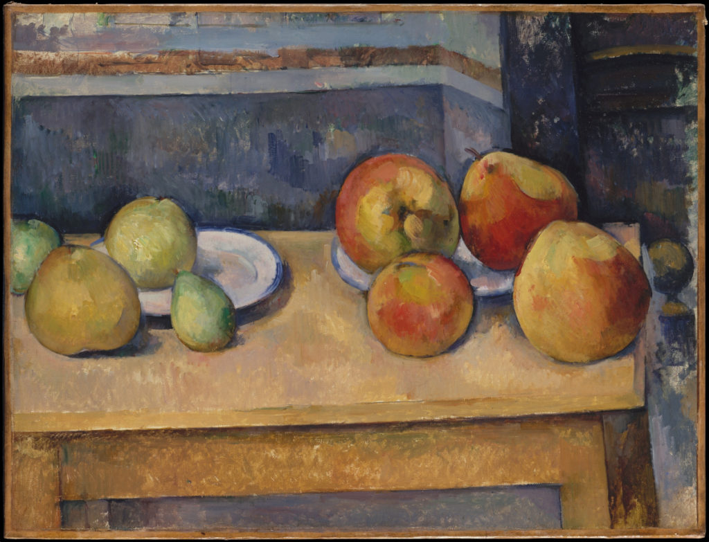
Here’s an example of one of his apple still life paintings. This painting is entitled “Still Life with Apples and Pears” and is on view (when it opens again) at the Metropolitan Museum of Art in NYC. See how much motion there is from the angle of the table? Also notice the wall in the background is different, has a corner in it right at the peak of the pear? Is it me or does it look to you as if each of the still life objects is about to run away, off to the left of the canvas?
What do you think of this painting? Do you like it? Do you want to spend more time figuring out what’s happening in the foreground, the table top and the background? Would you rather not have to think about those things when you look at a painting?
Homage painting
So, you’ll notice in this homage painting, that I didn’t paint with three different perspectives. I didn’t pile on huge amounts of paint either. That’s AOK with me right now. I am glad I thought about Cezanne while I painted this painting. But I wanted to paint luscious apples and tangy lemons in a bowl. So in some ways this is a tip of the hat to Cezanne; not a direct reference. However, his approach to painting certainly has me thinking!
Palette
I continue to use a palette with fewer colors than I used while I was attending school in Philadelphia from 2014 to 2019. But really, that’s not saying much! Why? Well, we used 20+ colors on our palettes. Lately, I have done paintings with as few as 5. This week, if you count the block-in, I used 7 colors. But I didn’t use Burnt Umber after the block-in. So, I guess you could say I used 6…or maybe 6.5 colors.
So I ended up using Alizarin Crimson Permanent, Cadmium Scarlet (OMG this is one of my absolute favorite colors), Raw Sienna, Cadmium Yellow Light, Phthalo Blue, Cerulean Blue and Lead White. For you smarty artists out there, you can see that I have 1 cool and 1 warm of each of the primary colors. As I think about a painting, I look for the least number of colors that will get me where I want to go.
This makes sense to me as I strive to create a sense of harmony in a painting. It also makes sense to me financially. So I waste as little paint as possible each time I paint.
Lead White
OK I am now venturing into territory that I am only just beginning to understand. But aren’t we all? Wait…I promise not to talk about the unknowns of the pandemic here. I’ll keep this conversation focused on lead white paint. However, I write about this luscious paint because it’s more expensive than many of the other paints on the palette. And, each artist can be very opinionated (who moi? HA HA HA) about their lead white preferences.
So, I decided to try a different lead white for all kinds of reasons including financial. I purchased Lead white #1. I was so excited to try this paint because it is less expensive than the version I had been using. But, alas I find it unpleasant to use. Specifically, it’s not buttery or smooth. Rather it’s almost tacky and stringy. I also found that it was cooler and more opaque than my preferred brand.
And, believe me, I did not just use the new lead white on one painting. I have used it for the last 5 or 6 weeks. In other words, I gave it a really good run. But, I don’t see myself ordering it again.
Light and Glare
Besides adjusting to and deciding I disliked the lead white paint I have been using, I am adjusting to the light in the new studio, too. While I was working on this painting, there were several days where the glare at specific times was difficult. In fact, I actually had to stop painting for an hour because the light coming in from the skylight was blinding me. Also, it was creating glare on the painting.
Here’s a photograph of how bright the light was on my painting hand!
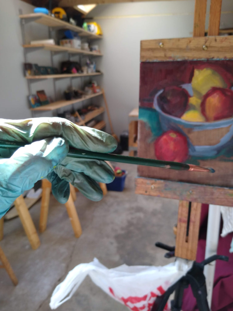
Solution? I decided to skip the hours where the glare was too severe. It’s turned out to be a fleeting problem. This week we have had cloudy and rainy days and the light has been absolutely exquisite.
I may sew some window covers for the skylights. I’m still thinking of a workable, usable and convenient design for the covers. For instance, it would be helpful if I had the ability to adjust the coverings without having to entirely remove them. The coverings in Norman Rockwell’s studio had pull cords on them. Hmmm…maybe I will need to make something similar.
For Sale
So, this week’s painting is for sale for $375. And, if you are interested in supporting my lead white habit and painting practice, then please click here to buy it and thank you! And, I’m excited to share that I have a portfolio page on my website now. There are other paintings for sale on that page. Feel free to browse around!
If you or someone you know is interested in seeing the new paintings I create and learning a bit about art history, too, sign up to receive weekly posts here. And feel free to share your favorite artists, paintings and what you like about them in the comments below. Stay safe and thank you so much!
8 Comments
PeggyI Timmerman
May 21, 2020Hi Julie,
In the blue family, I am curious which of the blues in this painting you would classify as warm and which as cool. I have always thought of cerulean as warm (since it leans towards the yellow side, through green), but I would have said phthalo also leans towards green. (And I have always thought of ultramarine as cool, but recently saw a chart where it is listed as warm. Help!)
Looking forward to your response!
Peggy
Julie Holmes
May 21, 2020Hi Peggy, I have always struggled with the concept of warm blues, too. At school we lined up all the colors in a specific way with both chroma (color) and temperature in mind. That helped me keep it clear in my head. So, on the palette we always had Phthalo Blue before Cerulean Blue. The thinking, then, that Phthalo is warmer than Cerulean.
Of course, I am only (newly!) familiar with oil paints. So I don’t know if these temperature references transcend media? I say this because I think you primarily work in watercolors, right?
Here’s a link to Gamblin Oil paints which confirms what I have stated: https://gamblincolors.com/color-temperature-list/ It lists all of the colors you mention in your comment and their temperatures too.
Thanks for reading and take care!
Peggy Timmerman
May 21, 2020Thanks Julie. I do see in the Munsell attachment that temperature is considered the most subjective measurement. So if your blue leans towards red or yellow, which is warmer?! I have always felt yellow was warmer, especially since those are the blues that do not create very clear purples (if that makes sense…). Oh well, maybe it is really only relative and doesn’t matter so long as we are clear when we are discussing these colors with other artists.
Julie Holmes
May 21, 2020Hi Peggy, We didn’t color match (Munsell) at school. We used Henry Hensche’s approach to color. His approach is definitely more relative. Here’s a PDF with a lot of information about his approach to color: https://przewodek.com/Przewodek/COLORIST_files/Henry_Hensche_Colour_Study.pdf
His is a visual comparative approach.
At Studio Incamminati, we did color studies and used different ‘gels’ on lights (you can now get light bulbs and associated apps on your phone to gain the same effect). So we would paint the same still life objects/figures with different light sources on the same objects/figures. Some of the questions we would ask while doing the color studies are: “What is the chroma (color), what is it’s value and what is it’s temperature?” We would ask the questions while comparing the color to other colors in the set up. Classmates and I were totally wiped out at the end of these sessions because your brain is constantly evaluating each color choice within this framework. I still do color studies today because helps me get a sense of the color relationships before I start the painting.
So whether you see Cerulean Blue as cool or warm is less relevant than it’s temperature within the environment you are painting. It may be cooler in one set up and warmer in another…the relativeness is all that matters. Check out the PDF and enjoy!
Kathy Michaud
May 21, 2020Love this painting,Julie and your reflections on Cezanne.
Julie Holmes
May 21, 2020Thank you Kathy!!!!
Beth Dyer Clary
May 29, 2020What interesting information about Cezanne, the painting process and paint itself. Have to say, acknowledging my bias, I’d rather have your painting in my house than the Cezanne! I LOVE the blue of the “tablecloth.”
Here’s my Ekphrastic response:
“Tell me what is in front of you, Lawrence.”
“It’s Mr. Holden.” I hated Thursdays. I hated this occupational therapist. Or maybe she was a physical therapist. I know longer cared to make the distinction. I hated them all.
“Go on,” she said in that patronizing voice. “You can do it.”
I swallowed what I wanted to say to her and instead said, “No Paul Revere bowl today?” Normally this young smarty pants put things in the silver Paul Revere bowl my wife, Celeste kept in the dining room. Not only did I not like her going into the dining room snooping around our valuables, but the way the light hit the silver bowl made it even harder for me to see.
“I listen to you, Law … Mr. Holden.”
I reached toward the bowl and knocked one of the pieces of fruit out of the pile she had put for me to identify. I grabbed it and pushed it up against the outside of the bowl. I turned and faced her voice, “Make note on all those goddamn papers: Reflexes of a pro ball player. At least I still have that.”
“Duly noted.”
That piece of fallen fruit felt like either an apple or a nectarine. This was the point, I guess. I needed to know the difference by touch, smell, any other way than sight. I picked up the other fruits buying time for the fallen one. “Two apples.” I held one in each hand. I put them to the side trying to decide if the fallen fruit felt the same, or had the same shape, texture. “I could probably tell you what kind of apple each of them are. This one,” I held up the one in my left hand, “is a Macintosh. And this one is probably a Gala. Celeste loves her Galas. Can you do that, Missy?”
I heard her snort just a little. “You call me Missy one more time, I get to call you Lawrence. My name is Amy.”
Julie Holmes
May 29, 2020Hi Beth,
Thanks for enjoying the painting and it’s bowl, fruit and table top!
Good grief this ekphrastic interpretation sounds ‘familiar!’ It’s not an exact story from the family memory files but there are definitely some references here that remind me of a certain family member recovering from a certain surgery…quite a different surgery from our Mr Holden here.
I love how you get the reader to ‘see’ what his impairment is. Fabulous Beth!
Thanks so much for writing these!