
In Season

Here we are, dear reader, knee deep in one of my favorite times for in season tomatoes. So even though it’s hot as “h-e-double-toothpick” right now, it sure is a delight to visit the local coop or farmer’s market and buy delicious, beefy in season tomatoes. Don’t you think?
A Series
Before I get ahead of myself, here’s a reminder about this blog, painting and post. Each is a part of a series called Favorite Things. This means each week I write about a painting and the process. You are welcome to follow along as I share the ups and downs of this studio and painting life I lead. To do so, simply sign up here. You’ll receive 1 email each week and get a first look at my latest painting. Woot!
Process
Now I will share the process for this painting and include a few realizations I have had along the way. Recall that a few weeks ago, I shared my value study exercises? No? Well, here’s the post about it. The longer I paint, the more I realize the value of these exercises. No pun intended.
Why? I’m so glad you want to know. You see, I think value exercises help keep my eyes ‘in shape’ so that I can more quickly adjust what I see. This is super important if you are drawn to painting realistically. So, yes, I still do value exercises before each painting. But, I am not doing the value scales before each painting. As a gentle reminder, here’s what the completed value scales look like in the image below.
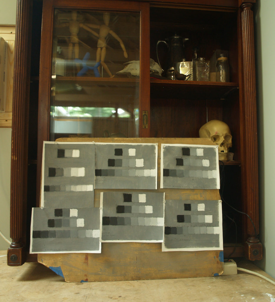
What I am doing is a value study of the actual painting that I do each week. And, while I do this painting, I have taken one of the value scales pictured above and placed it next to the still life set up. Why does this matter? Because I painted the value study of this week’s painting using 5 values and wanted to see and think about them as I did it.
Analytical Tool
Having a value study of the set up is a really useful analytical tool. This is super helpful for someone like me who tends to be super intuitive as a painter and not very analytical. If there’s one thing I learned in art school, it’s self-awareness helps. How? Well, if you know you’re not analytical or you know you aren’t methodical (cough cough), then you seek out ways to address these issues.
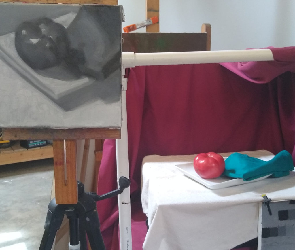
Here’s the value study I did for this painting.
More tools
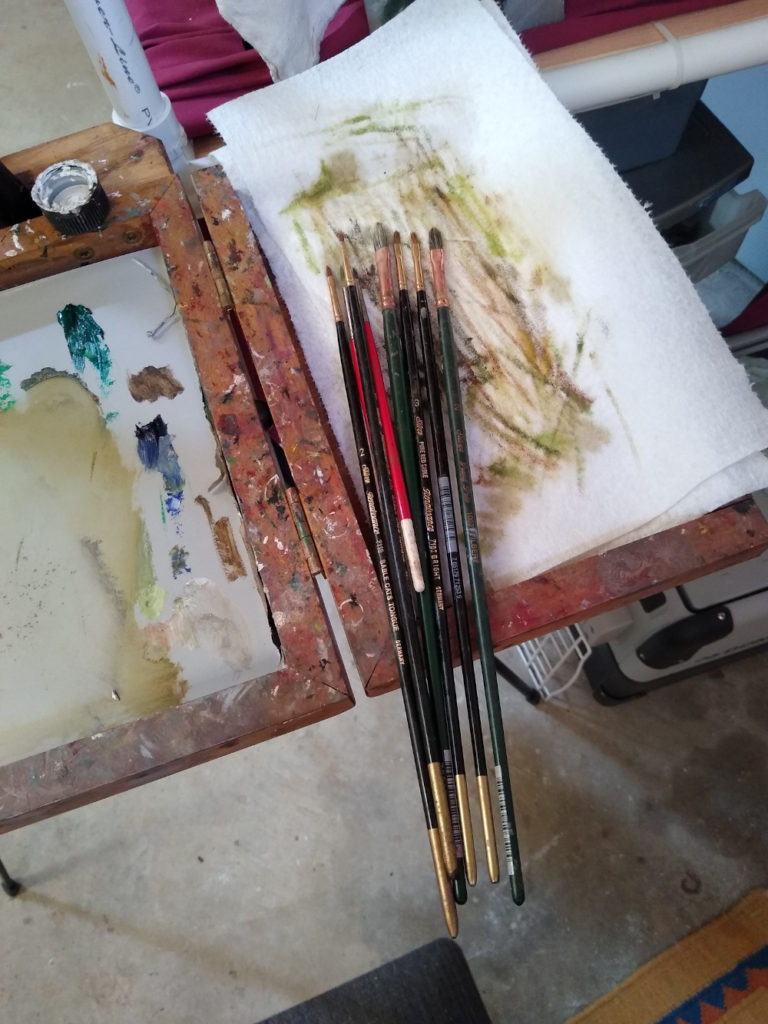
So I used to have a phobia about using any other brushes then Grand Prix Silver Filberts #4 and #2. Why? Welp, that’s what I used when I was in Philadelphia learning to paint. But with last week’s painting and this week’s, too, I decided to expand my brush choices. But I only do this after the painting is set up with proper values and big and medium sized shapes. So, in other words, with the two most recent paintings, I used small brushes as a reward to myself.
You can see the gazillions of little brushes I used in the photo below. I have found it’s especially fun to use these little brushes in a specific area. Then once that area is done, move on to another area nearby.
Palette
Here are the colors on the palette for this painting: Burnt Umber, Alizarin Crimson Permanent, Cadmium Scarlet, Raw Sienna, Cadmium Yellow Lemon, Cadmium Green Pale, Cadmium Green, Phthalo Blue, Cerulean Blue, Ultramarine Blue and Cremnitz White. I know I know…this is a huge list of colors. Right? But this is the first week I have not missed having a color and I have to say it was delightful.
For Sale
This painting is for sale for $375. You can see more details and the link to purchase in this page here.
Thank you
So today’s post includes a lot more process information than usual. I really appreciate that you have stayed till the very very end! Thank you! How about you? Are there tools and processes that you find are indispensable in your world? If so, please do share in the comments below.
6 Comments
Bthe Dyer Clary
August 27, 2020Very interesting and far more complicated and technical a process than I realized went into painting. This education you provide helps me look at paintings I see with more to consider. That’s great!
So my lingering question with this painting is why the blue, is it a napkin? I am curious how you decide WHAT to put in a still life. I saw a painting yesterday that was such a curious mix of things: a euphonium, a yellow flower – dahlia I think – in a glass case, a small white china statue of a young girl in a hooded winter overcoat, ripe cherries and a pen. Still thinking about that painting because of the odd collection of items. So, again, it makes me wonder how YOU choose what you choose to paint?
Julie Holmes
August 28, 2020Hi Beth,
Whoops! Glad you read the technical process and hope it was enjoyable?
While I can’t comment on the description of the other painting you saw, I can share the story behind the composition in my painting.
I had just gotten back from picking up my groceries at the local coop here. I was unloading food from the bags. The tomato stumbled onto a plate on the counter top right next to that luscious blue napkin. I had just gotten the napkin (and several others) as a belated birthday gift from a friend. The light in my kitchen is east facing; the same direction as the studio. I looked down at that yummy red tomato next to that gorgeous blue napkin and knew I had to paint it right then and there.
In this painting, I wanted the viewer to see the rich colors of the tomato and the napkin in that same moment that I had seen them while unloading groceries. The surrounding areas in the painting offer a more subdued place for the eyes to rest and recover from all that color! So, there you have it. Hope this helps!
Thank you for reading, looking and commenting here.
Alexandra
August 28, 2020Excellent job of capturing the colors of the tomato and napkin. I also sense the plump juiciness of the tomato. Bravo!
It was interesting reading the details of the technical process. Practicing with value studies before using a full complement of colors can be so helpful and eye-opening! I find that this exercise is often a surprise by either (1) showing me lights and darks I didn’t notice at first or (2) showing me that using a smaller range of value still creates a rich depiction of the subject.
Julie Holmes
September 2, 2020Hi Alexandra, Thank you for reading and looking here! Your observations about the value of value studies is really helpful to me. I hadn’t actually consciously thought about the second observation; that using a smaller range of values still creates a beautiful and rich depiction of the subject. And, your first observation is so well put. In the process of the doing, I guess I do see lights and darks that I may have missed at first.
Of course, your astute observations are probably two of the reasons why we love to paint? So that we can see some aspects of a person or object more clearly. It’s incredibly challenging and satisfying! Isn’t it? Thanks again for sharing your thoughts here.
Kathy Michaud
August 30, 2020Hi Julie,
I too was wondering about the blue napkin. Patriotic red white & blue? And then I read your description of arriving home from the coop and love that story with your painting.
Julie Holmes
September 2, 2020Hi Kathy, Good to know! Thanks so much for your awareness of your observation. It’s always interesting to hear how you, aka the viewer, perceive and see a painting! Right? Thank you for commenting and – Yay! – I’m glad you enjoyed the story about the painting!