
Putting Work in Time Out

This week I found myself putting work in time out. Why? I will share more here. But first I want to welcome new readers. Welcome! If you’re interested in learned about the focus and purpose of this post and blog, check out this link here.
Creating Space
Lately I have been working on several different paintings at once. This is a super helpful approach for me. Why? Because these paintings can get some attention and then get some time away from the easel.
Here are few of the paintings I have been working on this week. Oh and there’s another one on the easel too. That one is getting some ‘alone time’ for a few days. Ha!
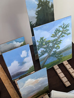
I find that stepping away from a painting for a day or two or three is really helpful. Why? I come back and can assess with a much more objective eye. And, I find I am less attached to the image when I do this too. This is important because I am experimenting with color mixing of late.
Mixing Greens
Recently, I heard a painter I admire say that she recommends spending a couple of years mixing greens from primary colors. This in turn reminded me of another wonderful painter who said when he was learning to paint, he only used the three primary colors plus white for four years. Good grief!
I decided to spend August (what’s left of it at least) mixing my own greens. In other words, use, blues, yellows, whites and even black to make green for these paintings. Here’s a picture of my palette after today’s painting session.
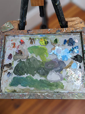
If you are especially observant, you may see that I do have sap green oil paint at about 1 pm on my palette. But I pinky swear promise I never touched it. Since I pop my paints in the freezer when not in use, I hope to use that green in the future.
To Compliment or Not
Another practice I have been avoiding is mixing the complimentary color, in this case red, to adjust the saturation of the green. Rather I have been using the other green mixtures and Hansa Yellow or Titanium White to adjust the color. I am noticing that this is helping me to see the color temperature differences in the greens more clearly.
My New Favorite
As I wield my palette knife to mix various yellows and blues to make green, I find I have a new favorite. It’s the warm olive green that happens when I mix Hansa Yellow with Ivory Black. Oh my what a delicious olive green that creates. But, as I have learned over the years, color is relative. Meaning the color can look and seem completely different depending on other nearby colors.
For now, though I am loving that olive green on its own and next to all the other greens I have mixed up this week. Not sure where all this color mixing is going except to add to my growing and evolving interest in oil paints in general and mixing colors in particular.
The Latest
That’s the latest from the studio, gentle reader. How are you? Have you been mixing things up and/or cooling things off in this hot and steamy summer? If so, please do share in the comments below. Thanks as always for reading here today.
4 Comments
Beth Dyer Clary
August 18, 2022There sure is A LOT to know about paint and painting. This week’s post has helped me gain a little insight into all that you consider, can consider? must consider? want to consider? when approaching that empty palette. Hats off to you for that, Julie!
A little added thing: I never thought much about the color olive until maybe 20 years ago when I was looking for a holiday outfit to wear to a corporate holiday party. I was with a friend and we looked at all the versions of Christmas greens and blue-ish greens and then this friend pulled out this unusual “sweater set” sort of that was a deep olive green. Blew my mind how it made my cheeks pinker and my eyes bluer and me feel good. From then on I became a HUGE fan of olive green! The set remains in my closet despite the lack of opportunity to wear it. So GO O:LIVE GREEN!
Julie Holmes
August 18, 2022Hi Beth,
Who knew? That is, I had no idea you were smitten with olive green too! It is such a wonderful and luscious color. And, I can see that it would look great on you.
Thanks for reading and sharing your wonderful point of view here. Always a delight to hear from you! xoxo
Pat Reid
August 18, 2022Julie, Very interesting today. I hope to start dabbling again soon. Thus, my question:
Do you keep a journal or index file on the recipes of the colors you mix?
Julie Holmes
August 18, 2022Hi Pat,
Great to hear from you!
Oh my goodness! I do not keep a journal or index file for the colors I mix…other than this blog here. But, I do have some track record of studying colors by mixing a new color with more and more white.
And when I was in school in Philly we spent a great deal of time doing color studies. That is, we would set up boxes covered in colorful paints or fabrics under different lights (warm and cool lighting). This type of ‘hands on’ learning is more effective for me than trying to remember the exact amount of paint I mix with another paint to get a certain color. Plus, color is relative. That is, a given color is modified and/or enhanced by it’s surroundings.
Now that I am pursuing plein air painting I realize how important pre-mixing colors on the palette is. But again, no recipe just looking, comparing, assessing, modifying.
It’s a challenging but joyful pursuit! So I hope you start painting sooner rather than later!