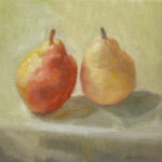
What a pair

Ever find yourself looking at a couple and thinking “What a pair?” I confess this happens to me all the time. Here’s an example: have you ever looked outside your window and seen a bluebird couple getting ready to build a nest? Yay you! It is, after all, that time of year.
The male bluebird is just like the more flashy and colorful pear in this painting I entitled “What a pair.” How is the male bluebird like a reddish pear, you might ask? It has the bright reddish orange chest. Similarly, the pear on the left in this painting has a bright red ‘chest’ too. I always see that first when I see a bluebird couple outdoors. In my artist notes below, I will share why I arranged this set up so that your eye looks as that red pear. But, let’s get back to bluebirds for a minute longer.
The female bluebird, however, is much more muted in her appearance. Instead of bright blue wings and feathers, she has feathers that are a muted blue-ish grey. Instead of a reddish orange chest, she has a dusty grey-ish brown chest. She is the yin to that male bluebird’s yang.
Artist Notes
I seek references in nature, like bluebirds, when I paint. I also bump right into references in nature at my weekly grocery store visit. When I was in the fruit section there, you can imagine how delighted I was to pick up these two pears. I immediately knew I had to add this pair to my 2020 series of paintings called Favorite Things.
I decided to take a different approach to this painting than I might have done a week ago. Why? Fortunately, I attended a fantastic workshop in downtown Raleigh with a painter named Zoey Frank. Holy Smokes her paintings are amazing for so many reasons.
At the beginning of each workshop day, Zoey showed and talked about paintings that inspire her. Since the workshop focus was the still life painting, her examples were still life paintings from throughout history. I loved the simple and fresh fresco paintings from Pompei painted in the first century, the austere Morandi paintings and artwork by artists’ whose work I had never seen or even heard of before. Some of these artists names include Gwen John, Lennart Anderson, Susan Lichtman and so many more!
Workshop Goals
One of my goals of the workshop was to focus on creating paintings using a limited palette. This may seem like a simple way to paint. But, my training at Studio Incamminati included a rich colorful palette of 25 oil paint colors. You might say that Studio Incamminati is the male bluebird of art schools! Ha!!! So as I set up my still life for the workshop, I truly wanted to seek color with fewer choices.
And that, dear reader, is also what I attempted with this week’s painting entitled “What a Pair.” I selected two gorgeous pears with rich and vibrant colors. I allowed myself to use only three colors plus ivory black and titanium white.
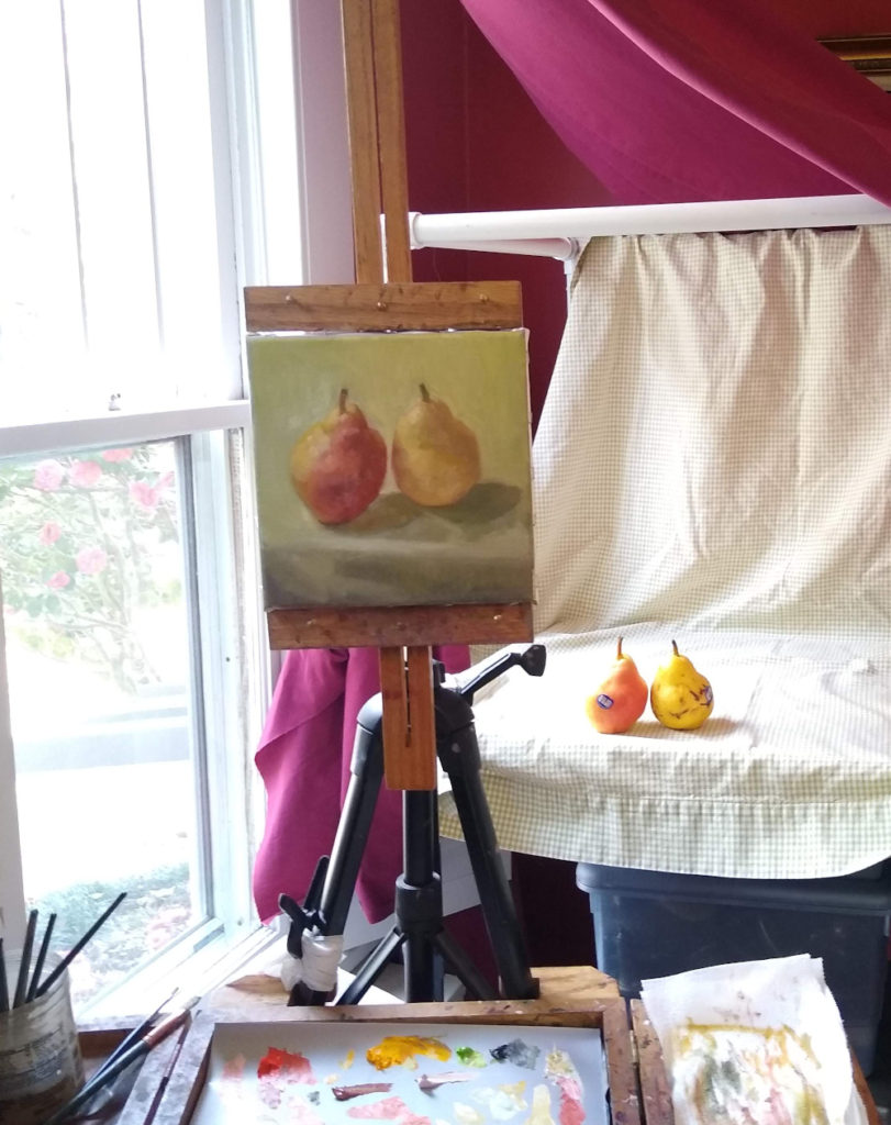
Here are the three colors I chose for this painting: cadmium scarlet, cadmium yellow and cadmium green pale. I started off thinking that I would only use two colors plus black and white. But, I just had to have that cadmium green pale color for this set up! Here’s a photograph of my corner studio and the painting in progress with east facing light.

I also decided to think about Morandi’s compositions in his paintings when I started this painting.
Bridges and Barriers
Another concept we learned was that of bridges and barriers in paint. In other words, use similar paint values for the parts of the still life objects that are similar to the background. Use different paint values to create a barrier. In other contexts, you may hear artists or art teachers mention softening or sharpening edges.
However, what was delightful to me about this concept is to name them as I was painting them. So in this particular painting, the bridges are in the light and the barriers are the shadow edges of the objects against the light background. I guess I could name a sharp or soft edge, but ‘hey!’ whatever works, right?
Assessment
So how do I think I did? Well, I learned a lot about the 3 cadmiums that I used. They are opaque and forceful colors. I was glad that I had ivory black to neutralize the impact of these colors. I confess that I kept wishing I had alizarin crimson on my palette but at the end of the day, I found a delicious deep and warm red for the red pear’s edge in shadow. Using three cadmium colors was actually super fun.
I think if I were to have been truly aligned with a Morandi composition, I would have set the horizon line in the composition. However, I did think about the bridges and barriers and how they are aligned within the composition and help your eye move between the two pears. So even though there is a bright red pear in the painting, I wanted the viewer to see and know there’s a second forceful pear, too.
So as with most new concepts, I think I see how much more I have to learn! But I am still basking in the glow of so many new ways to approach a painting. Whether I continue with this limited palette and another artist’s composition or consider the myriad of other options, I have lots of fresh new ideas to try and artistic problems to ponder. And, for that I’m really grateful. Especially grateful for this as we navigate this uncertain world where news about the Covid-19 virus is ever changing. Here’s hoping you stay healthy and safe.
SOLD
Yay! This painting is SOLD. If you are interested in receiving weekly updates of my blog with a new painting and artist notes, please sign up here. Share your thoughts on workshops or new ideas for your art practice in the comments below. Thank you!
