
Fa la la la la plus pumpkins and persimmon

Why name a painting Fa la la la la plus pumpkins and persimmon? Well I can’t wait to share with you. But first, here’s a warm welcome to new and returning readers of this weekly artist blog. For details on the purpose, read more in this link.
This Week’s Inspiration
People, occasionally ask me where I get ideas for paintings. There are times when the inspiration may seem a bit high brow. For instance, last week’s painting is inspired by Italian painter Giorgio Morandi.
This week’s inspiration? Let’s just say inspired by laundry and front porch tidy up time. In particular, I tossed several of the (rotten…oops) pumpkins that had been on our front porch for the fall and Halloween. Tossed into our compost bin, that is.
But two of the pumpkins? They are so still fresh and oh so orange. And, gah, I just love pumpkins. Plus, I love painting pumpkins. And, having just finished a class where the instructor is a virtual beast (ok master) at incorporating patterns into her paintings. I decided to look for fun patterns.
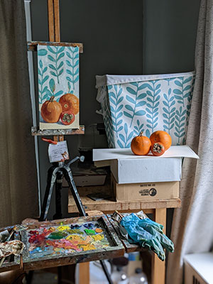
Here’s a photograph of the still life set up for this week’s painting. Check out that whimsical pattern on our laundry basket. Just add a persimmon to add some festive, seasonal reds and greens, right?
Painting Goals
Yes I incorporate goals into this latest painting. For instance, limit color palette. This is a big deal. Why? At art school, our palette requires 26 colors. Which 6 colors here? Alizarin Crimson Permanent, Cadmium Red, Yellow Ochre, Lemon Yellow, Phthalo Blue, Ultramarine Blue and Titanium White. This means I wield a palette knife in my right hand. So I can mix the oranges, greens and teal blues along with other un-nameable colors in the shadows.
It’s enlightening to me to see how many colors I can mix with these six colors. Another goal? Think about warm foreground and cool background. And, go as opaque as I possibly can in the cast shadows of the pumpkins and persimmon in the foreground.
Challenges
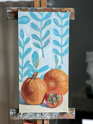
Gotta say the biggest challenge in this painting is that pattern in the background. But I took my time and had so much fun. And, there’s just something so pleasing about that beautiful teal blue when it’s in the same painting as oranges and reds. Here’s a photo of this painting still on the easel.
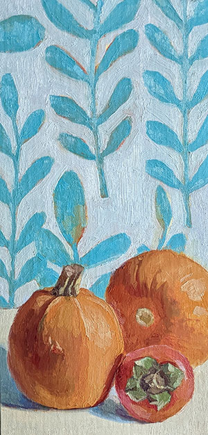
And here’s a closeup of this oil painting which is 6×12 inches on linen panel. Oh and it’s SOLD!
What Is Inspiring You
So, gentle reader, what is inspiring you these days? I would love to hear from you, especially if it’s your laundry basket! Ha! Please do share in the comments below and thank you for reading along today.
11 Comments
Alexandra
December 15, 2022That paintings positively glows, Julie! I especially like all the knobbiness of the pumpkins you captured so well. I also enjoy the contrast of value and orange/teal colors. Wish I had such a lovely laundry basket! Ours is made of your standard wicker-like material and weave. xoxoxo
Julie Holmes
December 15, 2022Hi Alexandra! Thank you. This is definitely one of those paintings that just flowed. Gotta love that when it happens, eh? Always wonderful to hear your insightful thoughts here. xoxoxo back at youuuu
Beth Dyer Clary
December 15, 2022Love this painting, Julie! I think BECAUSE of the pattern. I do love blues of all shades and the contrast with the other colors, as you say, is wonderful and rich. A very enchanting painting.
Julie Holmes
December 15, 2022Hi Beth, Thank youuu! You’re probably right about that pattern. And that blue has such a wonderful fresh feeling to it! Thank you so much for reading and commenting today! xoxoxo
Patricia Reid
December 15, 2022what fun!!!!
Julie Holmes
December 16, 2022TY so much, Pat! Super fun painting. So glad you can feel the vibe!
xxoo
Maria Baluis
December 15, 2022Beautiful painting! I especially love the little bits of orange showing through on the background pattern.
Julie Holmes
December 16, 2022Hi Ria,
Thank you so much! I am delighted you noticed and like the orange under painting. This is something I love to see in other artists’ paintings. Kind of a sneak peak into the whole process, eh?
Thank you for looking, reading and commenting here! xoxo
Denise Todloski
December 15, 2022Hi Julie! Another lovely combination of color and texture. The fabric pattern and colors make the rest of the painting come to life. All the colors sing in lovely harmony, all similar saturation and hue. I can tell you’re having some big fun; your creative spirit takes over. xx, Denise
Julie Holmes
December 16, 2022Hi Denise, Thank you for your thoughtful observations here. Technically, I am really enjoying using a limited palette of colors. It sets me up to create the harmony you describe.
And, you’re so right, I am having big fun here these days. Yahoo! Sending love and hugs your way! xx
Julie Dyer Holmes, Fine Artist Crazy Connections - Julie Dyer Holmes, Fine Artist
February 1, 2023[…] So let’s get back to this work in progress painting. OK? I have realized that ever since I painted this painting late last year, I love incorporating patterns into my still life paintings. So as I worked on this […]